Thanks to our brand new virtual world, more ways keep popping up to convince someone to come to your house party or start an entire social movement. So how would you do it?
Are your colours going to be bright, bland, or balanced? Is your font going to elicit fear, triumph, or a sense of melancholy? Choose a simple concept for a sense of comfort and calm, or an overwhelming array of objects that would evoke something more unsettling?
Design is still an art, and just as a good ‘art’ should, it requires no right answers. But that doesn’t mean you can’t get better at it. As Ellen Lupton, the curator of contemporary design at the Cooper-Hewitt National Design Museum, told the New York Times, “Experiencing good typography is like walking into a well-lit room. You may not stop to analyze it, but good lighting makes you feel better, and if it makes a sudden change for the worse, you will know it.”
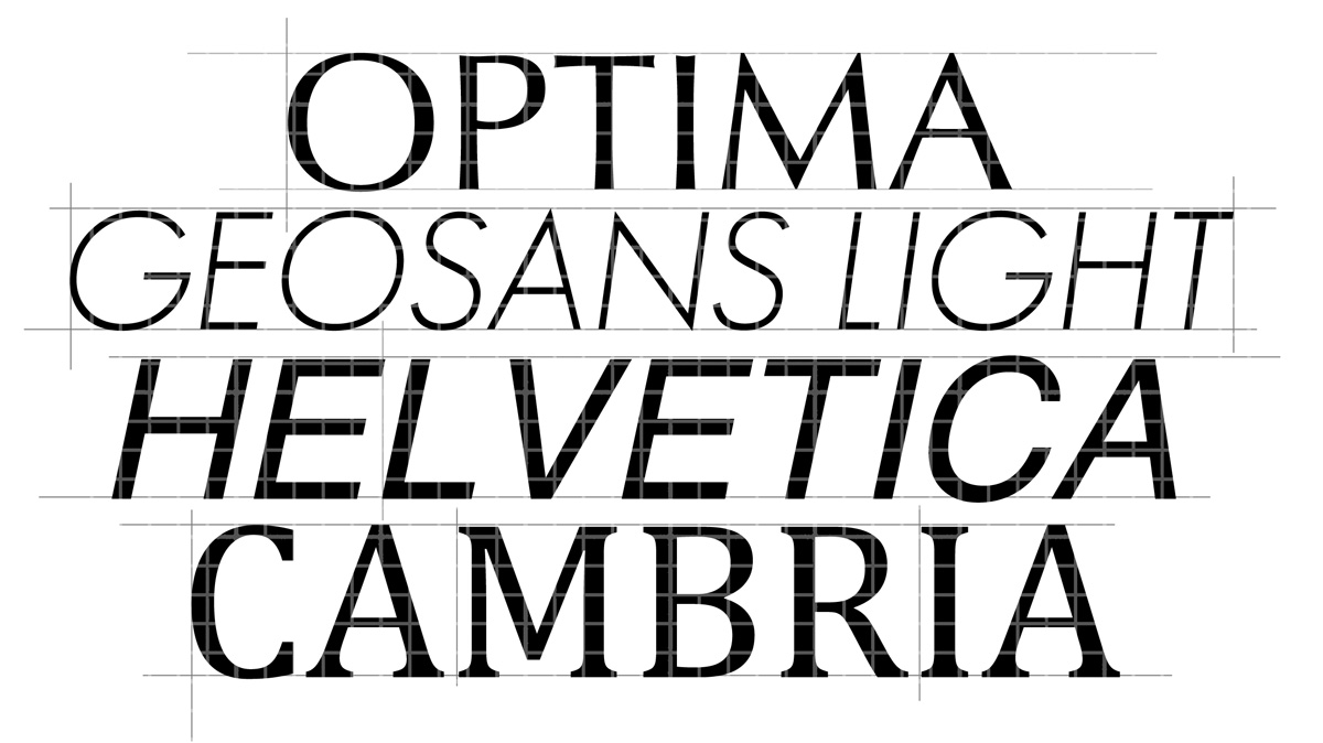
In the 2008 U.S. presidential election, both candidates selected fonts that they thought would represent themselves and their platforms. Barack Obama chose Gotham, a font that elicited hope and courage. In his book Just My Type, Simon Garfield suggests that this font, more contemporary in look than the original choice of Gill Sans, was selected to represent forward thinking while not scaring away the moderates. John McCain chose Optima, a relatively traditional, no-nonsense font. The New York Times ran an opinion piece that described his typeface choice as an odd attempt at portraying bi-partisanship, a 20th century modernity, and his war record. Some of the type design critics interviewed for the piece called Optima “[one of] the worst pre-computer typefaces ever designed,” “a seventies nerd,” and “a rather bland face used in a rather bland way.”
Elsewhere in the font and typeface world, there exists the ubiquitous Helvetica. This font has pretty much taken over the world. As the introductory scene of the documentary Helvetica points out, a brief stroll around Manhattan proves that American Apparel, Bloomingdale’s, Gap, Knoll, BMW, Jeep, Toyota, Kawasaki, Panasonic, Urban Outfitters, Nestle, Verizon, Lufthansa, Saab, Oral B, The North Face, Energizer, your iPhone, and many other organizations use Helvetica. You’re probably wearing Helvetica right now on the tag of your t-shirt or shoes. It’s everywhere, more everywhere than you think, and it’s not by accident.
In an interview with The Daily, local freelance graphic designer Eliot Edwards said, “though some of it is personal, I feel that there are still certain fonts that are so damn clean. Helvetica is the one.” Analyzing the elements of the font further, Edwards pointed to “the whitespace between the letters, the connectedness about them: they all look like they belong to the same family. The letter ‘a,’ the whitespace within the curve of the ‘a.’ [Type designers have] thought not just about the shape of the black but also the shape of the white within the letter.”
More and more research is being done on how these aspects of design are influencing us. With the speed with which technology develops now, fonts can be created, altered, and disseminated within minutes; they are more accessible now than ever, and more influential too. Fonts talk, and we should start listening.
If you don’t start listening to fonts and graphic design, you turn into Myspace. Oh, Myspace. Among many other issues, Myspace didn’t understand that design matters. Sean Parker, the founder of Napster and founding president of Facebook, said that Myspace “… was basically this junk heap of bad design that persisted for many, many years. There was a period of time where if they had just copied Facebook rapidly, they would have been Facebook.” In contrast to Myspace, Facebook has not only made their platform easy to use, but has controlled its basic template, such that it can never be overpowered by sparkles and ponies.
Almost everything we touch today has been designed to look a certain way (even if it’s been designed terribly). Through exposure, we have been implicitly studying design since birth, and are already very well educated in the discipline. The beautiful thing about this built-in education is that it is shared. There are so many of us that have grown up looking at the same commercials, the same websites, the same off-white walls, the same MSN Messenger interface (R.I.P.), the same cereal box covers, the same lots of stuff! As Jessica Helfland notes in Screen: Essays on Graphic Design, New Media, and Visual Culture, “from television screens to computer screens to movie screens … their presence in our lives is ubiquitous, seamless, endless. What we see on screen is obviously an issue of considerable importance to communication designers.” It is important that we consider the context within which we communicate, because we have more shared symbolic language than we think.
If you’re not familiar with the Steve Jobs story, he made Apple different because he knew that people like shit that looks good. He went to school for calligraphy, and hand drew Apple’s logo and drafts of the original computer’s design with a calligraphic pen. The reason that I’m not walking around campus with an Acer in my backpack is that MacBooks are aesthetically pleasing, and using them is a beautiful experience. Steve Jobs designed that experience, and all the other computer nerds who didn’t think aesthetics mattered got left behind.
So don’t be a computer nerd, or a C.E.O., or an activist, or a social worker, or a sales representative, or a carpenter, without thinking hard about design questions. The importance is not in knowing the right answers, but rather in being curious enough to ask those questions. Well-designed communication will make sure your opinion is heard. Show the world that you’re not just another run-of-the-mill Cambria or Times New Roman robot, but you are a beautiful, thoughtful, creative young person who uses Johnston Sans or Geo Sans Light! We all want things around us to look different, so know how to communicate well. Learn how to communicate well. Design is your voice.